SankeyMATIC Gallery: Energy Flows
Reworking a well-known example
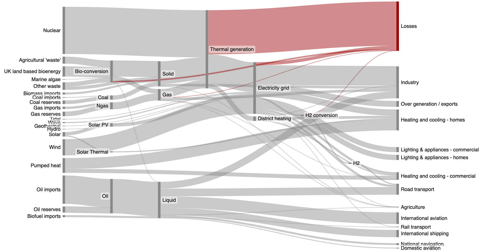
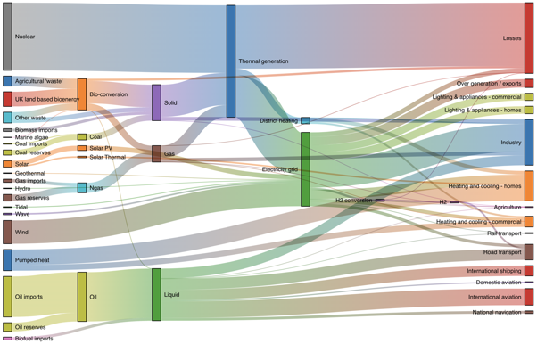
Diagram Notes: “This intricate diagram shows a possible scenario for UK energy production and consumption in 2050: energy supplies are on the left, and demands are on the right. Intermediate nodes group related forms of production and show how energy is converted and transmitted before it is consumed (or lost!).”
This energy dataset is used in the big library of D3 examples as a demonstration of D3's Sankey capabilities.
I have adapted the original inputs (found attached to the above page as energy.csv) to be in SankeyMATIC format; you can see the entire list below.
Some of the formatting changes I experimented with:
Nodes are narrower—just enough width to establish how large each is, and no more. This allows more room for the label text.
The outer labels are now outside the diagram, making it slightly easier to follow the flows.
Nodes are no longer multicolored. (I found the wide assortment of node colors distracting.)
After removing most of the color, it is easier to highlight specific flows. In this rendition of the diagram I called out the “Losses” node and the flows into it. With SankeyMATIC this only takes one extra line in the source data:
:Losses #900 <<
One interesting oddity about this diagram - when you enter all the original inputs into SankeyMATIC, several flows are called out as imbalanced:
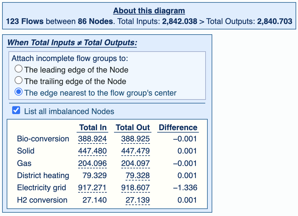
Regarding all the +/- 0.001 TWh differences: those are at the limit of the input data's precision and are easily considered rounding errors and not very important.
The more interesting line is the “Electricity grid” imbalance, which is noticeably larger.
I've tried to look into the original data, but haven't been successful in pinning down what may be missing. My theory is that since these are all projections, it's possible there was a slight miscalculation in the original spreadsheet.
Whatever the source, the error is still quite small: 0.15% of the total size of the “Electricity grid” node. The fact that the IN amount is less than the OUT amount by 1.336 TWh is barely even visible at this diagram size.
Summarizing:
SankeyMATIC will tell you when there is an imbalance of any size in your diagram.
SankeyMATIC will render whatever it is able to, despite any imbalances.
You can copy & paste these inputs to SankeyMATIC to reproduce the above diagram:
See the Manual for more specific examples, or return to the Gallery home page, or go forth and try out a diagram of your own.