If you are a regular user of SankeyMATIC and would like to contribute to the continuing improvement of this site, consider joining.
There are 4 tiers of support.
Above the lowest tier, you can get a link back to your own site from the About page.
At the highest tier, you can also have your logo and a link on the home page (which averages over a thousand visitors per day).
For more details, visit patreon.com/sankeymatic
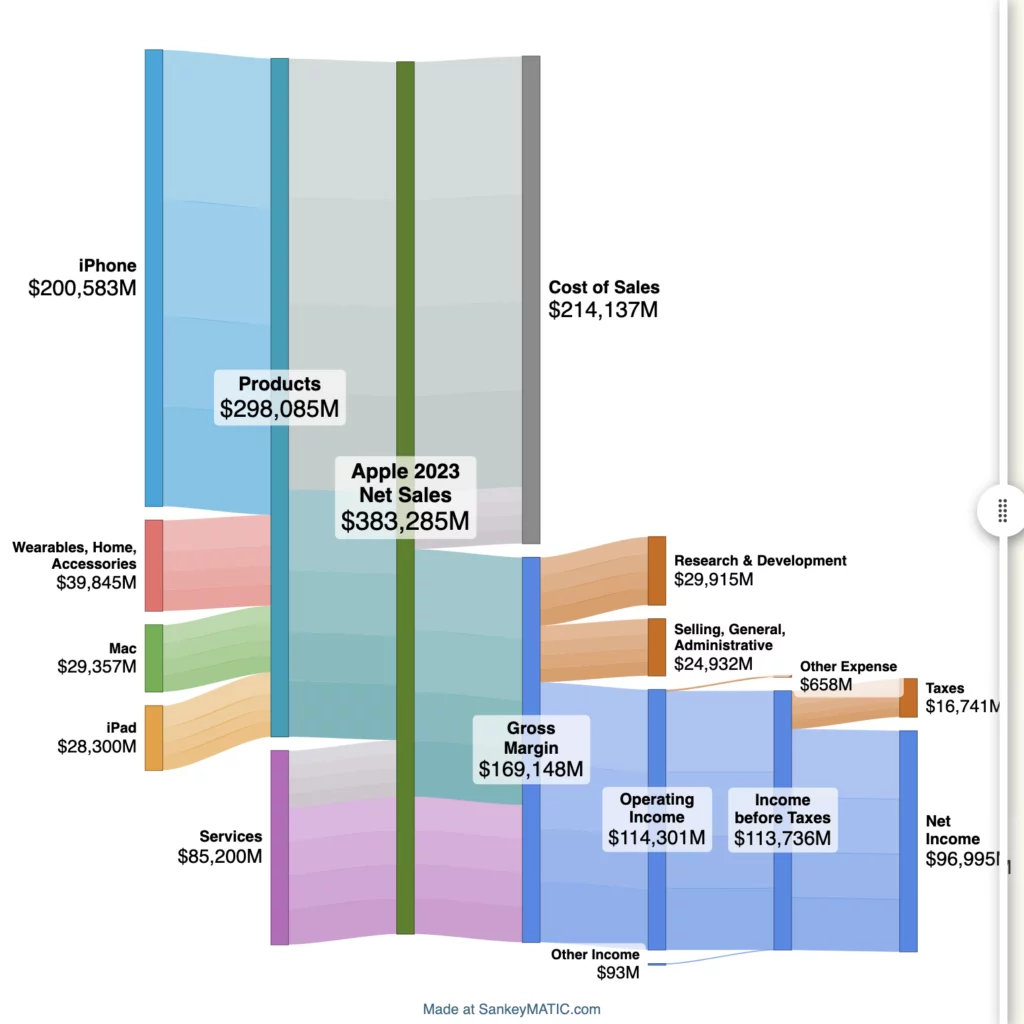
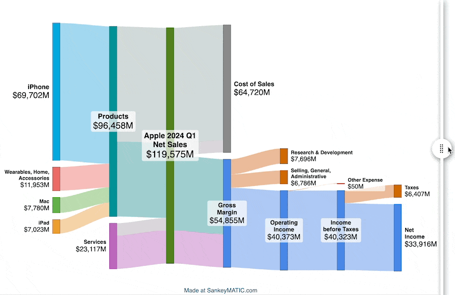


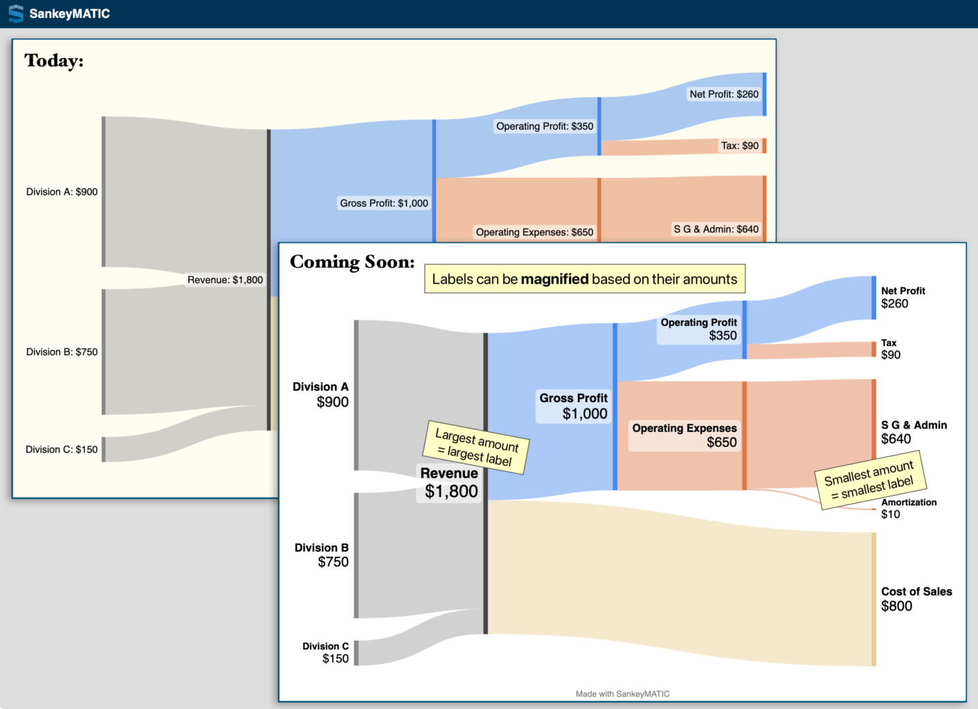

 join their revenue amounts into a single \"Revenue\" node with a value of ,800, which is then split into Gross Profit (,000) and Cost of Sales (0).
The Gross Profit amount is further broken down into smaller components representing Expenses of various kinds until a remaining Net Profit of 0 is shown.")
