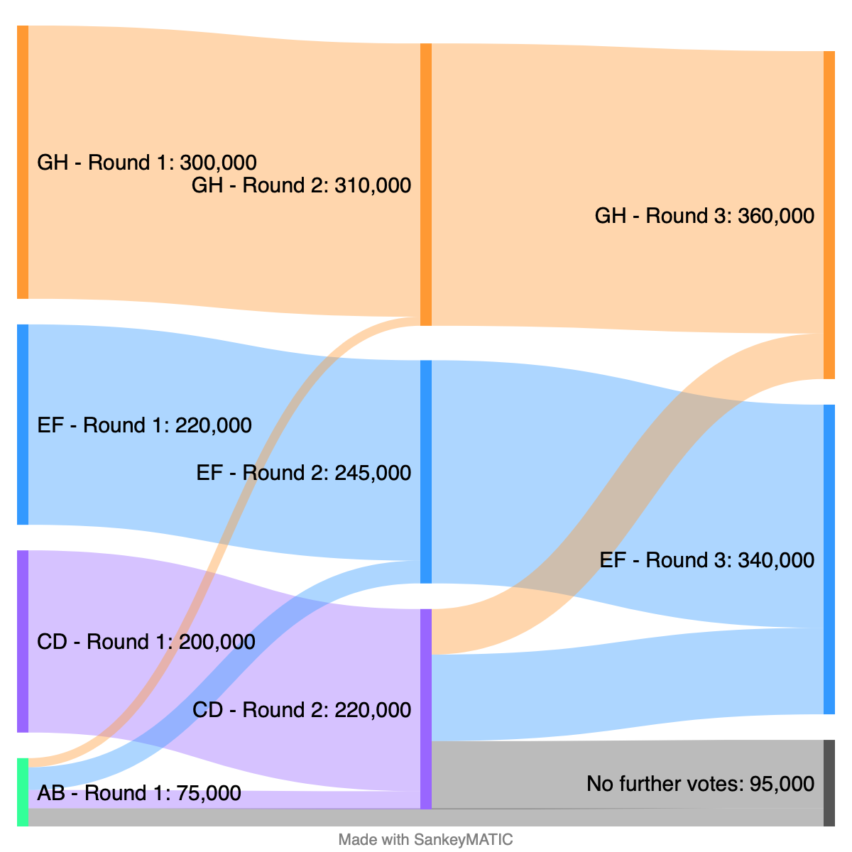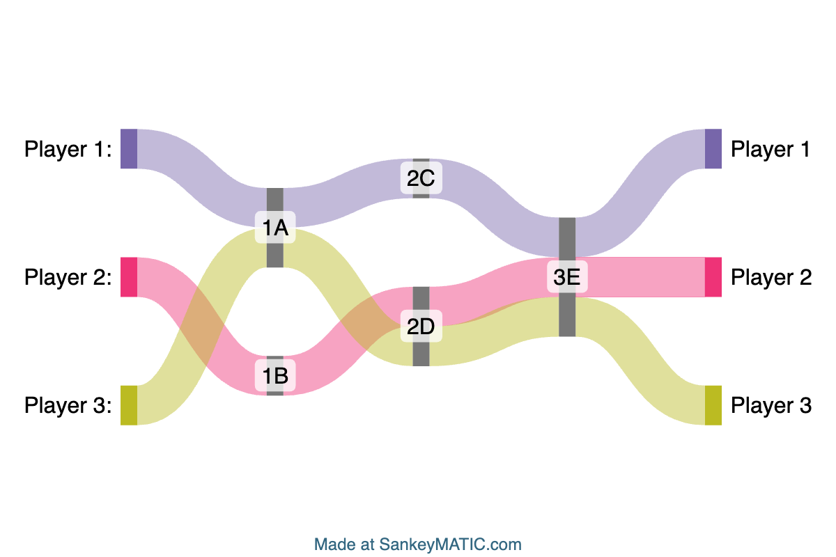
There’s a new Sample Diagram to try out at the top of the Build-a-Diagram page: Journey, which demonstrates how you can produce traceable paths for multiple players across multiple stages by using a specific approach to encoding your data.
It was added in February of this year. The conditions required for this kind of diagram to work are:
- Each flow maintains a single color from start to end.
- All flows for a particular player must be listed together.
- The “Arrange the Diagram” control must be set to “Using the exact input order”.
In the sample diagram, every flow for every player has the same value (1), but that condition isn’t absolutely necessary as long as the other conditions are met.
This diagram style can be used for such things as a ranking chart for team standings in a league (sometimes called a “bump chart”).
This post prompted me to go track down when each of the other sample diagram types was added, for comparison:
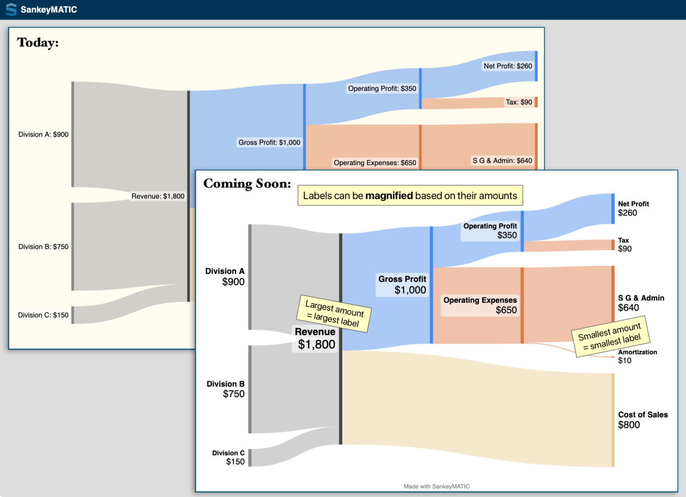
- “Financial Results” & “Start Simple“: December 2022
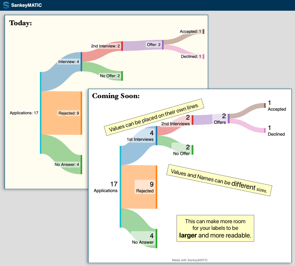
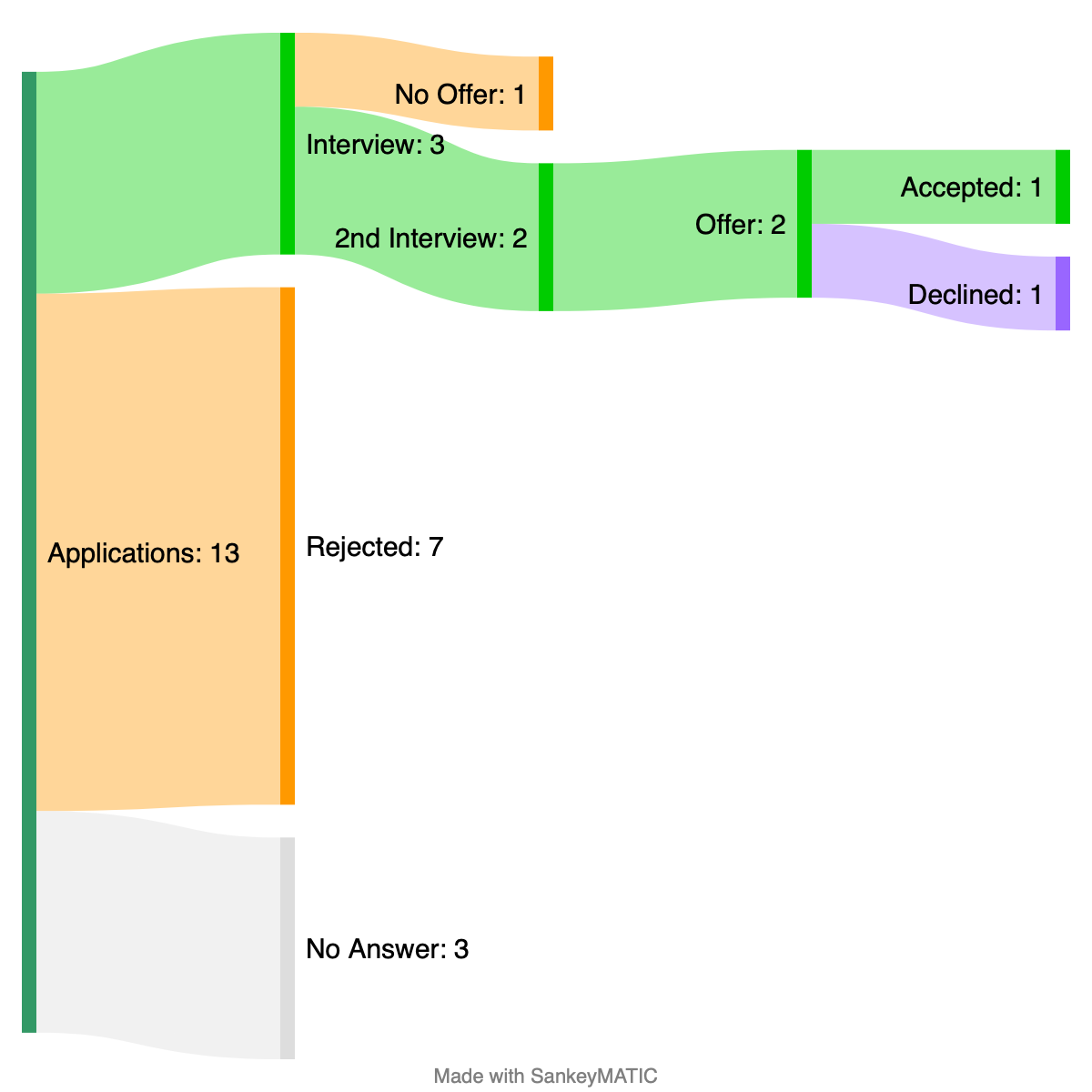
- “Job Search” & “Ranked Election“: December 2021
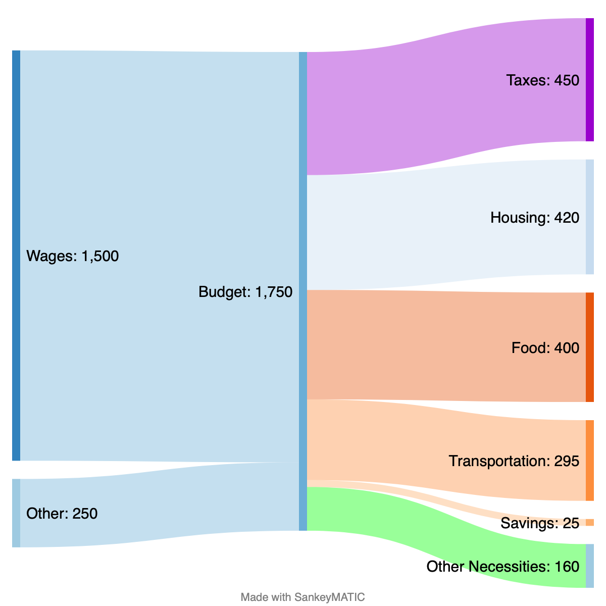
- “Budget“: February 2014!