Two upcoming SankeyMATIC Label features about to ship –
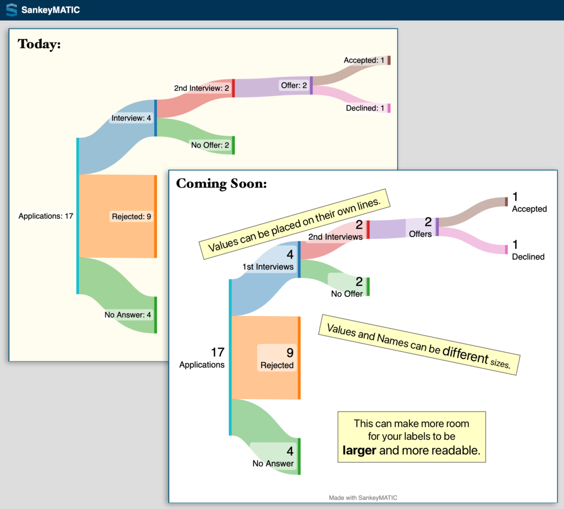
New Feature #1 – Placement & sizing
Names and Values can be placed on separate lines and can be given different sizes.
The Job Search example shows how this can allow larger & more readable labels by using the available space differently:
![A before & after comparison of a Job Search flow diagram made with mock data using SankeyMATIC.
From left to right, the diagram shows a total of 17 Applications which flow into three separate nodes: 4 "No Answer", 9 "Rejected", and 4 "Interview". The "Interview" flow is broken down further as the job search process continues through more stages, ending in 1 offer Accepted and 1 offer Declined.
In the 'before' version, all names & values in the labels are on the same line and are shown at the same small size.
In the 'after' version, the value for each node is presented on its own line first (using a very large text size), and the name of the node is on a second line. The name's size is smaller than the value's, but it is still a larger text size than the 'before' image.
Annotations on the 'after' image read:
* 'Values can be placed on their own lines.'
* 'Values and names can be different sizes.'
* 'This can make more room for your labels to be *larger* and more readable.'](https://sankeymatic.com/news/wp-content/uploads/2024/04/2023-05-16-preview1-job-search-1134x1024.png)
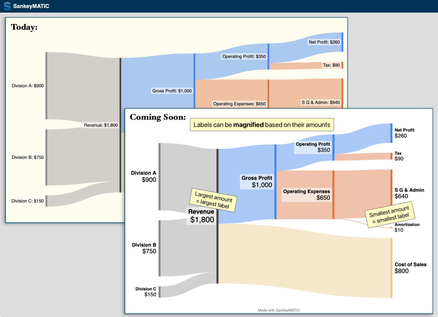
New Feature #2 – Scaling based on value
You can make each label larger or smaller based on the amount it represents.
The Financial Results example shows how this can help draw attention to specific areas of your image:
![A before & after comparison of a Financial Results flow diagram made with mock data using SankeyMATIC.
In this diagram, 3 company divisions (A, B, and C) join their revenue amounts into a single 'Revenue' node with a value of ,800, which is then split into Gross Profit (,000) and Cost of Sales (0). The Gross Profit amount is further broken down into smaller Expenses of various kinds until a remaining Net Profit of 0 is shown.
In the 'before' version, all names and values in the labels are on the same line and are shown at the same small size.
In the 'after' version, each name is shown first on its own line and the amount is on a second line using a larger text size.
The key difference being shown is that each label's overall size is scaled according to the amount it represents.
* The largest node is 'Revenue' (,800), and its label is presented using the largest text size.
* The smallest node is 'Amortization' (), and its label's text size is much smaller.
* All other nodes in between have labels sized in between those two extremes, scaled according to their own amounts.
Annotations on the 'after' image read:
* 'Labels can be *magnified* based on their amounts'
* 'Largest amount = largest label' (placed next to the 'Revenue' node
* 'Smallest amount = smallest label' (placed next to the 'Amortization' node)](https://sankeymatic.com/news/wp-content/uploads/2024/04/2023-05-16-preview2-financial-1413x1024.png)
Open the ‘Labels‘ panel in the left column to use the new features.
(cross-posted from vis.social/@SankeyMATIC)