SankeyMATIC Gallery: A Monthly Budget
Walking through one diagram, from concept to completion
In 2013, there were numerous stories across the media about a proposed “Sample Monthly Budget” put together by McDonald's and Visa. The sample budget is shown here:

The original source website has been taken down, but here are some sample stories which survive in 2023:
- Forbes: “Why McDonald's Employee Budget Has Everyone Up In Arms”
- The Atlantic: “McDonald's Can't Figure Out How Its Workers Survive on Minimum Wage”
While a list of several labeled numbers has a long history as a common method of data presentation, let's see what kind of picture we can make of it with a Sankey diagram.
First, let's diagram the Income.
Each job can be treated as one “flow” of money into a shared pool from which the expenses will be taken out.
For our first line of data, let's take the income from the first job and put it into the shared pool. You can call the pool anything; I'll label it “Monthly Budget”.
Flows are entered in the format:
Source [Amount] Target
For this first line:
- The Source of money is called “Job 1”
- The Amount of income from that job is $1,105
- The Target is “Monthly Budget”
So our first line to enter looks like this:
Job 1 [1105] Monthly Budget
(We leave out symbols and commas and just enter the raw number “1105”; labeling the values will come later.):
Entering this line and clicking the “Show >” button produces this diagram:
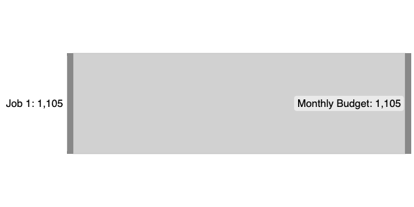
This is as simple as a Sankey diagram can get: a single Amount is flowing from one Source to one Target.
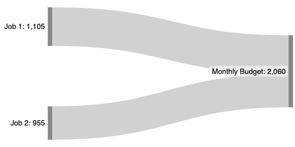
The data line for the second flow (“Job 2”) looks almost exactly like the first:
Job 2 [955] Monthly Budget
Now “Job 1” and “Job 2” are both flowing into “Monthly Budget”, which is showing the sum of the two.
(If you look closely, you can also see that Job 1's flow is just barely wider than Job 2's.)
The Income side is done. Now we turn to the Expenses.
For these data lines, the money's Source will be the “Monthly Budget”, and the Target for each line will be the name of the Expense.
Starting with the first one from the list, we add $100 from Monthly Budget to Savings:
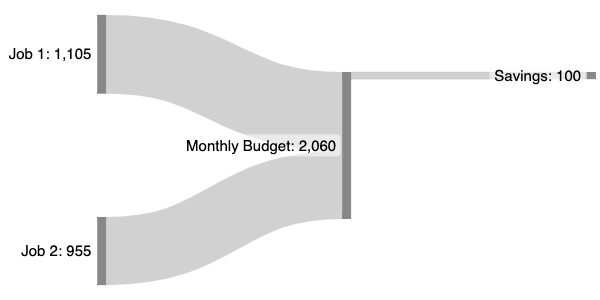
Right after entering the first expense, you may notice some additional information at the bottom of the screen, looking something like the following:
|
When Total Inputs ≠ Total Outputs:
|
Here, SankeyMATIC is alerting us that the total amount flowing into the “Monthly Budget” Node is not (yet) matching up with the amount flowing out of it.
This cross-checking can be useful for catching missing data lines, in cases where you expect your total inputs to match your total outputs (like budgets).
Since we are not yet finished entering data, we can ignore these imbalance messages for now. (You can turn the messages off entirely by unchecking the 'List all imbalanced Nodes' box.)
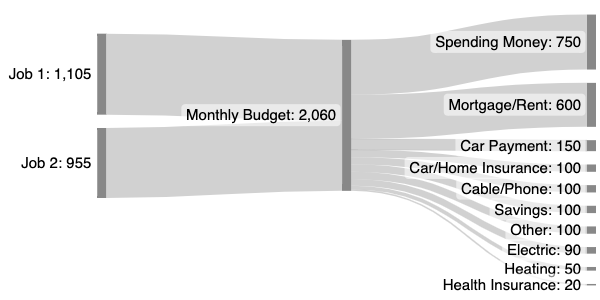
After adding lines for the rest of the Expenses, including the $750 for Monthly Spending Money, the diagram is once again “balanced” – the Monthly Budget has the same amount flowing in as it does flowing out:
Note: In general, SankeyMATIC will display flows in the same order that they appear in the data.
Here I have deliberately ordered the Expense amount lines from largest to smallest. Experiment with other orders to see the diagram change!
Our data is all entered. Time to start customizing the diagram's appearance!
First, the Expenses part of the diagram is a little crowded at a size of 600x300. Let's give it some room to spread out.
After changing the Diagram Height to 400:
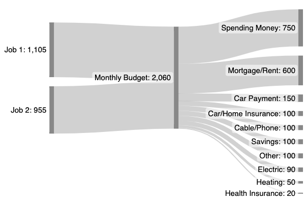
Now there's a bit more room for the text, so under the Labels & Units section we can increase the Label Size.
While we're there, let's also give the amounts their proper format by putting a “$” in the “Units Prefix“ field.
After changing the Label Size from 15px to 16px and setting the Label Units Prefix to “$”:
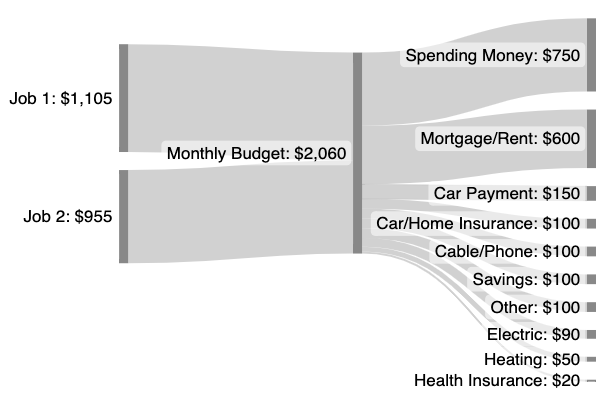
At this point, the diagram is fairly readable and could be considered complete.
However, you can go further to emphasize specific amounts using colors.
One common approach is to set the most favorable numbers to green and the least favorable numbers to red.
There isn't a particularly bad flow or group of flows here, but let's try highlighting the “Spending Money” and “Savings” flows in green.
As laid out in the Manual, we have ways to control the colors of individual Nodes using a new kind of line – a “Node Definition” line.
That's a type of data line which lets you assign to any particular Node a color and (optionally) the directions in which that color should be ‘painted’ on to flows.
The format of a Node Definition line is:
:Node-name #Color >> <<
In this diagram, we will use "<<" to tell SankeyMATIC that any flows to the left of this Node should be painted with its color. (Since there are no flows to the right of this Node, there is no need to include the ">>" token.)
After adding two Node Definition lines to the bottom of the input data, setting two Nodes to green (hex color code #090) and painting the flows to their left.
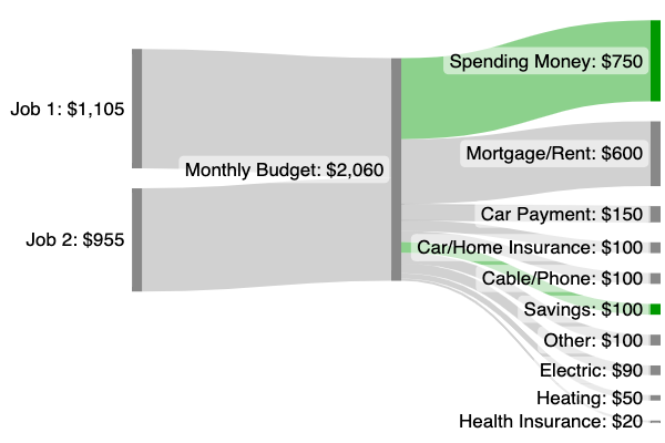
We could also try a different coloring approach to communicate some other information besides just ‘good’ or ‘bad’ flows.
Here's an experiment in styling the Job flows using McDonald's signature colors and the colors of another likely employer (the largest private employer in the US, Walmart).
This is achieved by assigning each Job Flow and each Job Node their own specific color.
For the Job Nodes, we'll use a Node Definition line as above (but without painting the color in either direction).
Then to assign a color to a specific flow, you can add an HTML color code to the end of that flow's input line, like so:
Source [Amount] Target #Color
After assigning custom colors to each Job's Node and Flow:
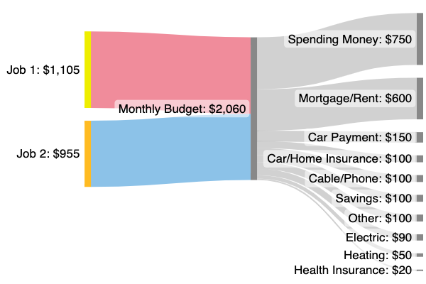
Hang on – those flow colors look very pale. Why?
Because: by default, flows are displayed as semi-transparent – in case you have flows which overlap, you can still follow each one's path if they are not completely opaque.
You do have control over this, though; you can adding a further suffix to your custom flow color, between .0 and .9, to set the opacity for each flow:
Source [Amount] Target #Color.Opacity
After adding an opacity of .8 to both custom-colored flows, their colors are now much stronger:
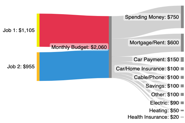
Whatever the merits of this particular coloring scheme (or of this diagram as a whole), it should be clear that SankeyMATIC makes it fairly easy to:
- quickly sketch a Sankey diagram to reveal the shape of your data
- control your diagram's size and appearance in various ways
- try out your own coloring ideas rapidly
That concludes this walkthrough!
See the Manual for more specific examples, or return to the Gallery home page, or go forth and try out a diagram of your own.