SankeyMATIC Gallery: U.S. Federal Budget
Comparing values across Sankey diagrams
See also: Scaling Diagrams for Comparison in the SankeyMATIC Manual.
Let’s begin with some 3D pie charts and work our way toward a very different visualization.
This example was spurred by an observation from David Yanofsky about the Federal Budget as shown on the IRS' yearly tax forms:
The IRS-provided "Here's where your money is going" pie chart continues to gain thickness and data-obscuring tilt — ᴅaᴠiᴅ ʏaɴoғsᴋʏ (@YAN0) - April 15, 2014 (originally on Twitter, now deleted)
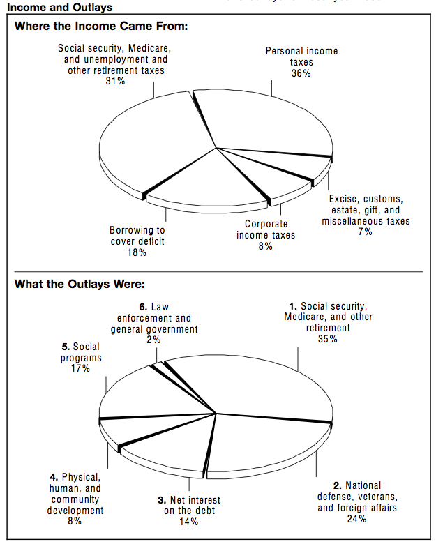
To illustrate, here are the pie charts from the original IRS 1040 forms for budget years 1993 & 2012:
1993:
2012:
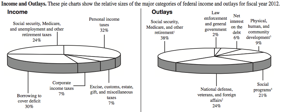
Source: IRS.gov PDFs
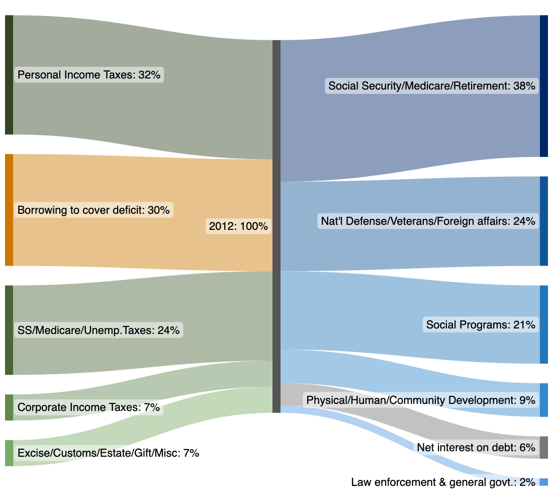
Here is the same data from the four pie charts above, now converted to two Sankey diagrams.
Income and Outlays have been converted to flows in and out of a single Node for each year:
Federal Receipts and Outlays as a Percentage of Budget
- Green = Receipts, blue = Outlays, orange = “Borrowing to cover deficit”, gray = “Net interest on debt”.
- Between 1993 and 2012, you can easily spot the growth in deficit borrowing (as a percentage of the whole) and a reduction in the proportion of payments of debt interest.
- Note, these only show percentages, not dollar amounts (yet).
1993

2012
SankeyMATIC Source Data:
The above diagrams lay out the relative proportions without any distortion from 3D tilting. Comparisons between all of the pie ‘slices’ are therefore easier.
Now that we have the two diagrams, though, what if we want to compare the two years to each other?
Then the above diagrams are not that useful—the 2012 budget could be ten times the size of 1993’s (or vice versa) and these diagrams would still silently imply that the budgets’ sizes are similar.
We need some actual amounts to compare, not just percentages.
Searching for actual federal budget numbers leads to the U.S. Government Printing Office (GPO), which has an entire website named GovInfo.gov with a wealth of historical data available for download.
I found the numbers underlying these pie charts’ percentages in the Historical Tables section of the latest budget, specifically:
- Table 1.3 - Summary of Receipts, Outlays, and Surpluses or Deficits in Current Dollars...
- Table 2.1 - Receipts by Source..
- Table 3.1 - Outlays by Superfunction and Function...
- Table 3.2 - Outlays by Function and Subfunction...
When you dig into the real dollar amounts, you discover there is actually another flow to account for: “Undistributed Offsetting Receipts”, which is treated as a negative outlay. (The original IRS documents linked at the top do mention this amount in a footnote, but leave it out of the pie charts, since a negative amount is...difficult to display in a pie chart.)
You can render the negative outlay and keep your diagram in balance by:
- treating it as a flow in from the left of the diagram
- coloring it to match the other Outlays (in this case, blue)
- (optionally) nudging the node rightward to more clearly distinguish it from the ordinary Receipts flows
So, plugging in the dollar amounts for the two years (unadjusted for inflation) produces:
Federal Receipts and Outlays in “Current” Dollars
- These dollar amounts are not yet adjusted for inflation.
- The Unit Labels in the diagrams have been updated. Instead of a Suffix of
%, now the Prefix and Suffix are$andB(for billion)
1993

SankeyMATIC Source Data:
2012

SankeyMATIC Source Data:
This still isn’t good enough for a useful comparison, since between these two years the value of each dollar changed a great deal.
Happily, we have access to all the information we need to improve this comparison. The GPO provides a “Composite Deflator” figure for each year in its Table 1.3 document, which can be used to convert both sets of numbers into equivalent dollar amounts for the same period.
By dividing each year’s dollar figures by the Composite Deflator for that year, we can adjust our amounts to be expressed using the same units (in this case, FY2012 dollars).
- FY2012 Composite Deflator for 1993: 0.6574
- FY2012 Composite Deflator for 2012: 1.0000
Having done this for all of the above amounts, the diagrams now look like this:
Federal Receipts and Outlays in 2012 Dollars
- The 1993 diagram's amounts, now expressed in FY2012 dollars, have all changed from above...but the diagrams look the same in every other way. This makes sense—scaling the values does not change their proportions to each other at all.
1993

SankeyMATIC Source Data:
2012
SankeyMATIC Source Data: Same as above
Now—finally—we are comparing equivalent units across the years: FY2012 dollars.
But we still have to glance back and forth and read every number to understand the differences.
So. Let’s make a billion dollars on the left
the same size as a billion dollars on the right, shall we?
SankeyMATIC makes this possible by always letting you see what the scale of your diagram is, expressed in terms of the units you are using.
Look under the “Layout Options” section of the controls to find it.
The scales for the above diagrams are:
- 1993: Diagram Scale = $5.9398B per pixel ($2,200.7B/370.5px)
- 2012: Diagram Scale = $9.8262B per pixel ($3,640.6B/370.5px)
We have two choices to get these scale numbers to match up more closely: we can make the 1993 flows smaller, or make the 2012 flows bigger.
Since differences between flows are harder to discern the smaller you make them, it is often good to go bigger if your particular constraints allow.
In this case I chose to shrink the 1993 flows to match the scale in the 2012 diagram as closely as possible (in order to keep the diagrams' sizes constant throughout this page).
The controls which will affect a diagram's scale include: the Node Height slider, the Top and Bottom Margins of the diagram, and the overall Diagram Height (which I chose to keep constant here, but you do not have to).
This involves some amount of trial and error, and you may not be able to match exactly, but you can get quite close.
In the end, I reduced the Node Height slider from 75% to 45% and increased the Top Margin from 3 to 5, which results in a new 1993 Diagram Scale of: $9.8333B per pixel ($2,200.7B/223.8px).
Now, one pixel of height represents $9.8B in both diagrams. Much better!
Here are the resulting diagrams, finally visually comparing dollars-to-dollars across years:
Federal Receipts and Outlays in 2012 Dollars
1993

SankeyMATIC Source Data: Same as above
2012
SankeyMATIC Source Data: Same as above
Now, it is far easier to compare amounts between the diagrams!
You can easily observe changes such as:
- Every category of funds grew in absolute terms, except for “Net Interest on Debt”.
- “Corporate Income Taxes” grew from 1993 to 2012, but not as much as “Personal Income Taxes” did.
You can imagine extrapolating this to display Sankey diagrams from several years together, all sharing a common scale.
Or you could show different slices of a large data set next to each other, scaled for accurate comparison.
One additional option exists to make comparisons between the two even more direct:
SankeyMATIC can reverse a diagram to flow right-to-left. This would mean that the Outlays in one diagram could be displayed immediately next to the Outlays in the other.
This option is also under the “Layout Options” section in the controls. It is simply a checkbox named: “Reverse the graph (flow right-to-left)”. Checking that option and re-producing the 2012 diagram gives this result:
Federal Receipts and Outlays in 2012 Dollars
1993
SankeyMATIC Source Data: Same as above
2012 (Reversed)

SankeyMATIC Source Data: Same as above
The Outlays are now even easier to compare directly.
(Comparing the Receipts in a similar way would just be a matter of swapping the two diagrams’ positions.)
Summary:
- Thinking about making pie charts? Consider Sankey diagrams instead.
- SankeyMATIC always calculates your diagram’s scale. You can use this information to make multiple diagrams which share a common scale.
- The input amounts must be expressed using the same units in all of the diagrams.
- Pick one diagram’s scale to serve as the target and adjust the parameters of the other diagram(s) to match the target scale as closely as possible. See also the Scaling Diagrams for Comparison page in the SankeyMATIC Manual.
- Do you have a negative amount to represent? Consider having it flow into the source node (since positive amounts flow out), then emphasize its different nature using color and node position.
- SankeyMATIC can easily swap the direction of your diagram to be right-to-left. (Consider this option carefully, as it could be confusing to your audience.)
See the Manual for more specific examples, or return to the Gallery home page, or go forth and try out a diagram of your own.