Big updates: Better layout, new controls

3 small example diagrams showing some of the new output capabilities of SankeyMATIC. The first example is a funnel where the initial nodes lose value and converge on a single final node. The second is an image where one node splits into two child flows; the top child node splits into two more child flows; then the top grandchild splits into two more flows. The third is a binary tree showing 8 elements collapsing down to one and then splitting into 8 nodes again on the far end. Each type of image will be referenced below.

Adapted from a Mastodon thread.

Friends: I have been spending time in the Land of Somewhat Challenging Geometry Algorithms.

After an extended stay there, I return to you with some visible improvements to share.


Improvement #1: A better layout engine!

SankeyMATIC has new ideas about how to arrange Nodes and Flows.

It now puts more effort into producing more balanced, more symmetrical, less lopsided diagrams.

Below are a couple of examples showing the difference it can make.

(To make comparisons clear, the same data inputs were used for the Old vs. New versions.)


One specific improvement these changes make possible:

Tree diagrams which are symmetrical!

You see tree patterns in lots of places, including sports tournament brackets.

Despite their simple structure, SankeyMATIC was not handling them well before.

It’s much better now:


When your data has any other internal symmetry, the diagram ought to reflect that when it can.

Now, Flows from Nodes which don’t have their full value flowing in/out can attach to the bottom of a Node when that makes sense.

This usually makes such diagrams look better, e.g. in the case of a funnel pattern:


Improvement #2: More precise controls

The “Spacing” slider for Nodes has split into two: “Height” & “Spacing“.

Before, the slider was controlling both height & spacing, which wasn’t flexible.

Splitting them up gives you many more possibilities for how your diagrams look (as seen in the example images above).


In summary:

  1. Better-looking layouts!
  2. More precise visual controls!

Try out the changes! In particular, play with the Height & Spacing sliders to see how they interact.

P.S. The code behind these improvements is already posted to github.com/nowthis/sankeymatic. The commits from October 2 – November 3, 2022 contain the key changes.

P.P.S. Enormous thanks to everyone who has donated in the past; your interest and generosity help to motivate work on improvements such as these. 🙂
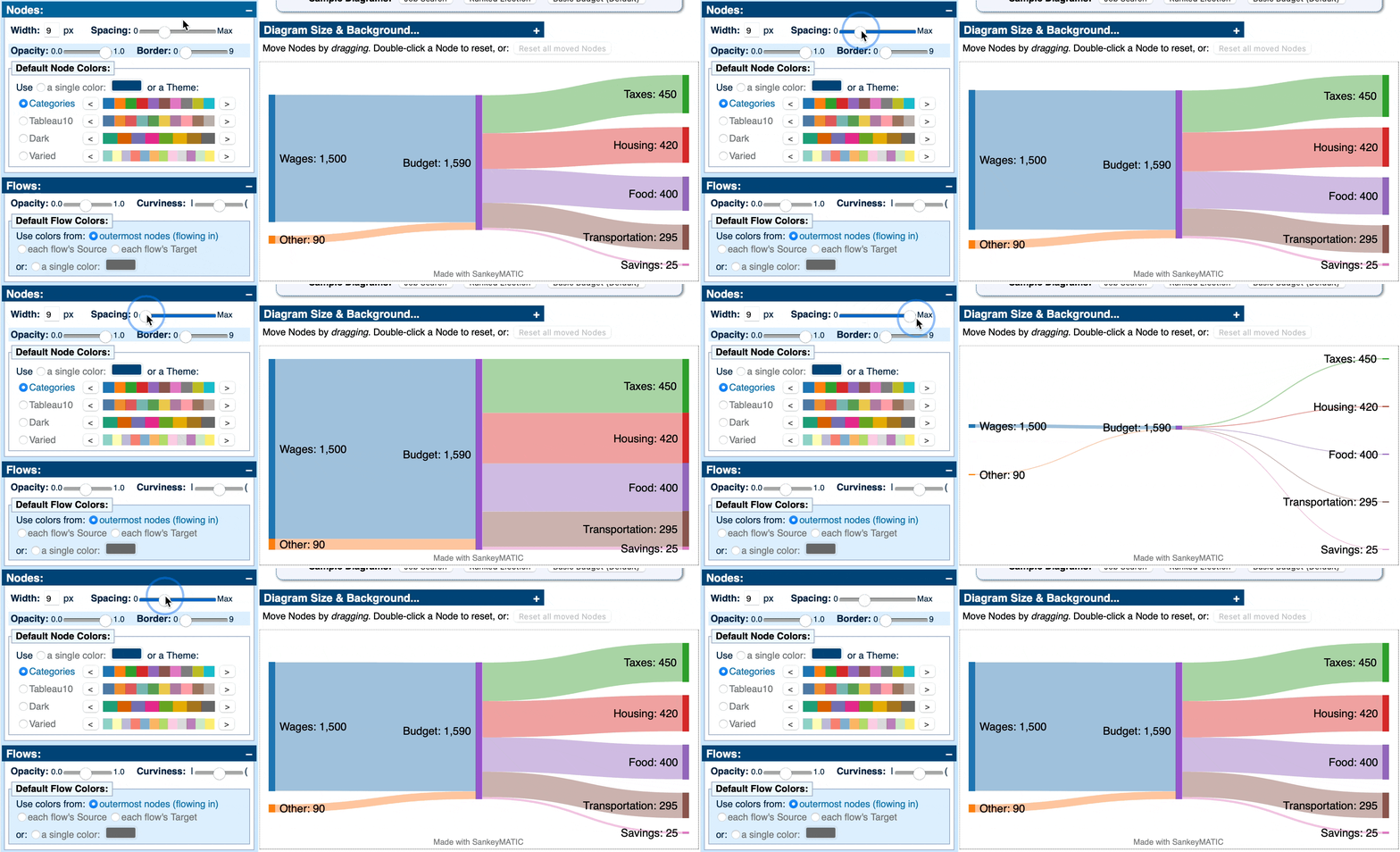
New Feature: Control your diagram’s Spacing with a slider!

In the past, you could type a number to set the spacing between each Node in a column, but:

  • Getting the spacing just right involved a lot of trial and error.
  • If you changed your diagram’s height or margins, the spacing value was not adjusted accordingly.

Now, you have a ‘Spacing’ slider which gives you an easy way to try out many different spacing approaches without needing to guess at a specific number.

And as a bonus, the look of your diagram will be preserved even when you change the height or margins.

Animation showing the SankeyMATIC interface with the new Spacing slider. Sliding the thumb to '0' removes all the space it can, making the flow diagram look more like a simple horizontal bar graph. Sliding the thumb to 'Max' makes the flows as thin as they can be (without making them disappear entirely).
A short animation showing the feature in action

One thing to keep in mind: The more spacing you add, the harder it becomes to accurately compare flow sizes, as you can see above.

Try it out! It’s actually pretty fun to experiment with.

(Honestly, it’s one of my favorite features ever.)

More fixes

  • Color themes were not being applied to Nodes when their names used non-Latin characters. This now works as expected. Thanks to @IvanaGyro for the bug report.