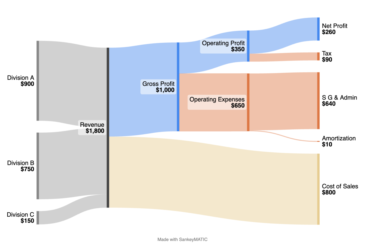
More on New Label Features

Two upcoming SankeyMATIC Label features about to ship –

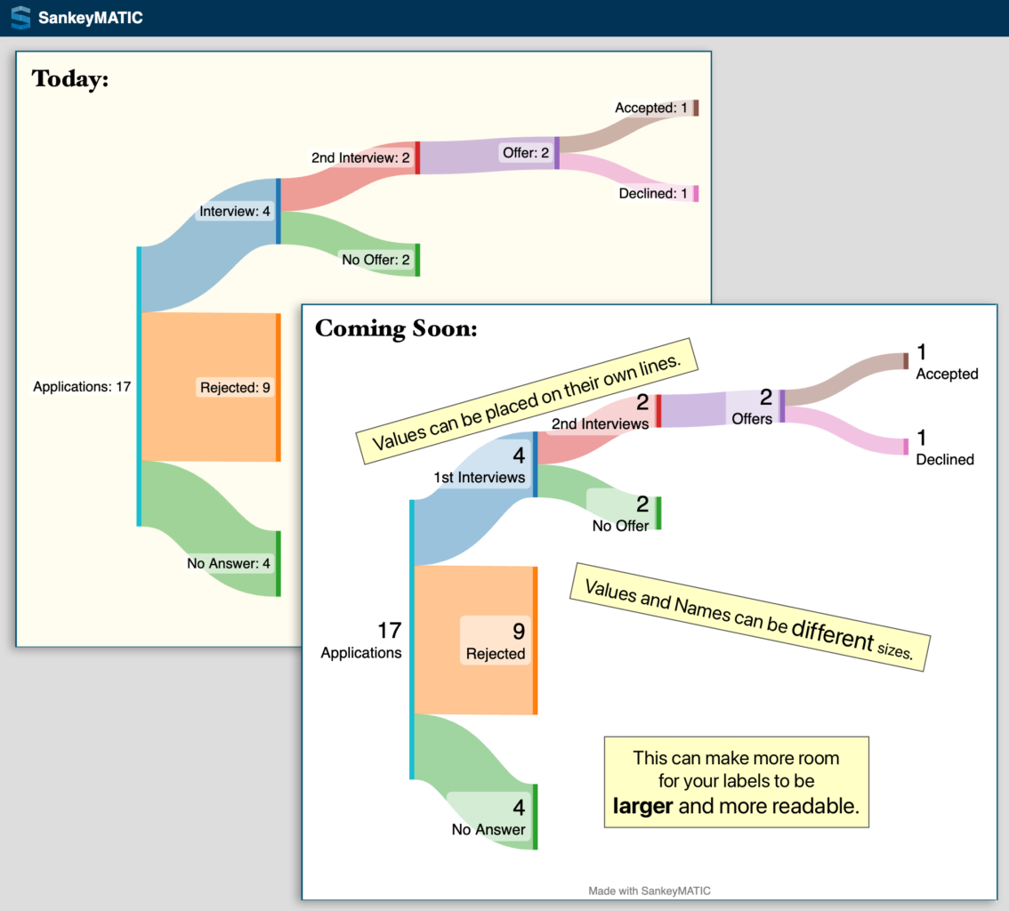
New Feature #1 – Placement & sizing

Names and Values can be placed on separate lines and can be given different sizes.

The Job Search example shows how this can allow larger & more readable labels by using the available space differently:
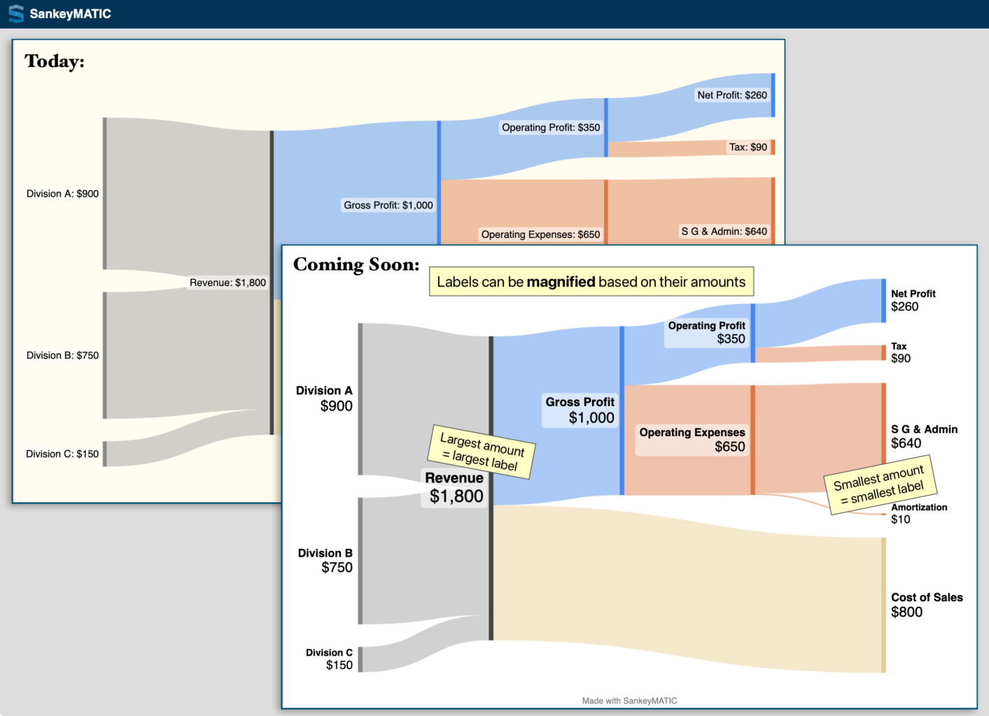
New Feature #2 – Scaling based on value

You can make each label larger or smaller based on the amount it represents.

The Financial Results example shows how this can help draw attention to specific areas of your image:
Open the ‘Labels‘ panel in the left column to use the new features.

(cross-posted from vis.social/@SankeyMATIC)

New Feature Roundup!

Been busy making lots of changes, but haven’t been making lots of announcements.

Fixing that now!

Below are some highlights from the period April through early October, 2022; some of these items may get expanded posts in the future.

(The more recent major layout changes will get their own separate post soon.)

  • Three major long-awaited changes:
    • April: When you drag a Node to a new position, the Node stays where you put it. (It no longer snaps back to its original position just because you changed the font size, diagram height, or anything else).
      • You can use the Shift key when dragging to constrain the move to be only horizontal or only vertical.
      • Double-clicking a Node moves it back to its original position.
    • July: When you place your labels before the first Nodes or after the last Nodes, the diagram’s width is automatically adjusted to give them enough room.
      • This makes it simple to try different label positions without needing to change any margins.
    • October: You can now make the diagram use the exact order of your input data, no matter what the effect is on the layout.
  • Improvements to accessibility and to the overall user experience:
    • June: Labels on your diagram will now have higher contrast ratios by default, by adding a translucent highlight rectangle around them.
      • This allows you to use darker flow colors without sacrificing readability.
      • The highlights can be turned off using a slider in the Labels section, but I think you’ll like how much easier labels are to read.
    • June: When changing any slider (and when hovering over one), you now get a tooltip telling you precisely what value the slider is currently at.
  • More minor improvements:
    • June: When you hover over a flow, the nodes at both ends of that flow now have their labels emphasized. This can be handy when diagrams have many, many flows.
    • June: Node borders work much better now. The border width can be controlled more precisely, and their widths are included when determining how much room there is for labels (and for the rest of the diagram).

Try out these changes on the Build page!