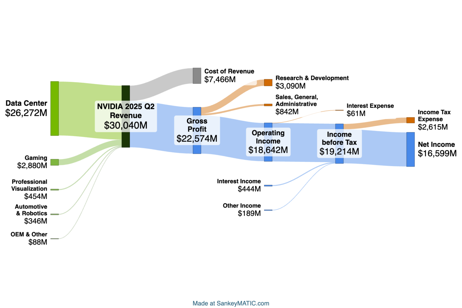
Some new example financial diagrams are posted – the latest quarterly results for NVIDIA and for Apple.


There’s a fun new feature on each of these pages as well:
The top diagram on each page now has a ‘public link‘ that lets you use it as the starting point for a diagram of your own. Just look for this on each page:

Try out the links! You may encounter a new technique, or you may arrive at a better layout than I did. 🙂 Here are all 3: NVIDIA 2025 Q2, Apple 2024 Q3, Apple 2024 Year-to-Date.
Beyond the new make-your-own links, you’ll see some additional changes if you happened to visit those pages before:
- The Data pages are now reorganized. Rather than having an extensive directory structure, there is now just one page for all of a company’s Quarterly diagrams and (in the case of Apple) another for its Annual ones. This should be rather less work to maintain, so hopefully it’ll be easier to keep them up to date.
- There is now an index of thumbnails at the top of each page, to help give you a broad overview of recent history before you get into the details. (In data visualization terms, it’s a set of small multiples.)
- The quarterly results are arranged in rows of 4 so that you can scan up & down to compare the same quarter across different years. This makes it easier to see at a glance, for instance, NVIDIA’s growth over one year’s time:
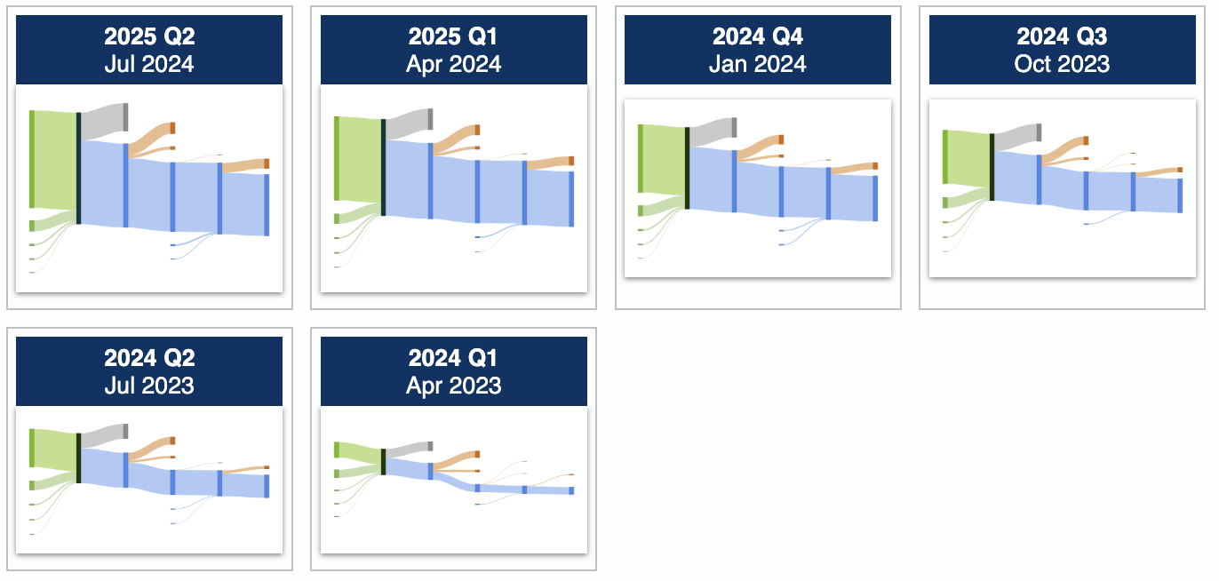
- The scale which is used for every diagram on a page is now listed at the top.
The next question you might ask is:
Why not use the same scale across all of these pages?
The short answer is, the companies are just too different in size. Considering just NVIDIA and Apple:
- If you made NVIDIA use Apple’s scale, most of its diagrams would be pretty tiny, making it hard to arrange labels in any readable fashion. (See NVIDIA’s Q1 2024 for an example where the flows are already getting too small to comfortably label, even at the scale I chose.)
- If you made Apple adopt NVIDIA’s scale, then Apple’s diagrams would be incredibly tall.
That’s why each page is considered independently in terms of which diagram scale will provide good readable diagrams at a reasonable size.
For fun, here’s what NVIDIA’s biggest-ever quarter would look like if it did use the same scale as Apple’s latest quarter (compare to the NVIDIA image above):